GIGANTIC
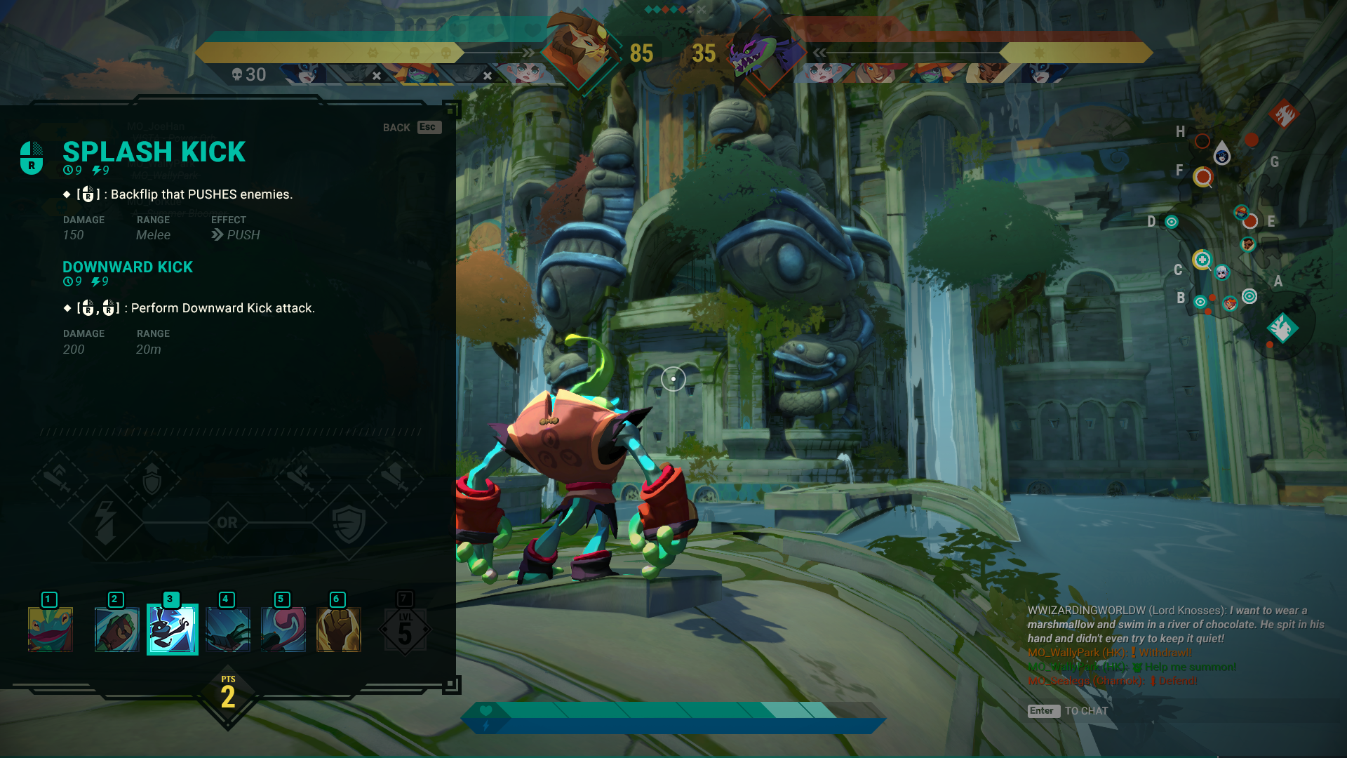
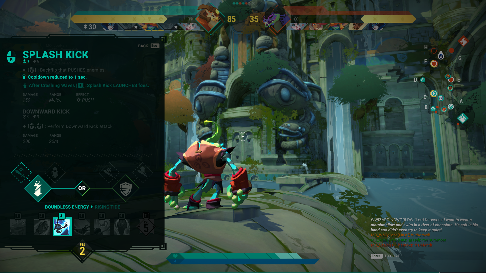
Skill Bar HUD
////////////////### The What
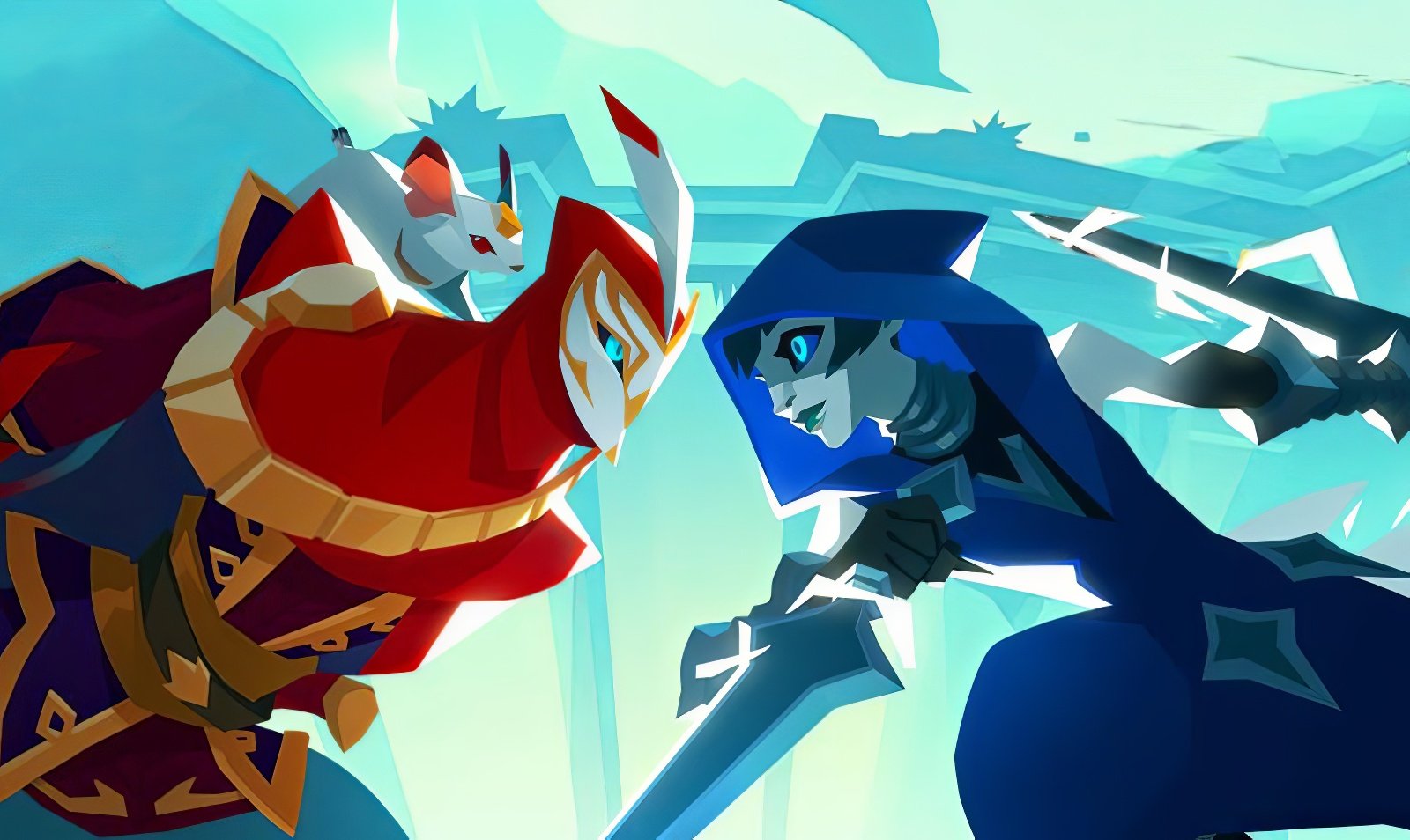
Gigantic is a fast and fluid Strategic Hero Shooter where you battle against and alongside massive Guardians in strategic team gameplay.
### The Why
Players had difficulty keeping track of all the on-screen information and were overwhelmed by the intricate web of skill upgrade trees.

////////////////## Past State of the HUD
The HUD elements were placed far apart, creating a disjointed user experience. Moreover, the subtlety of some pertinent information made it easy for users to miss out on essential details completely.
////////////////## Design Exploration
It was tasked to explore different layouts and flows that included more information for each upgrade path. The Designers wanted information on skill cooldowns, stamina, damage, range, and status effect per upgrade.
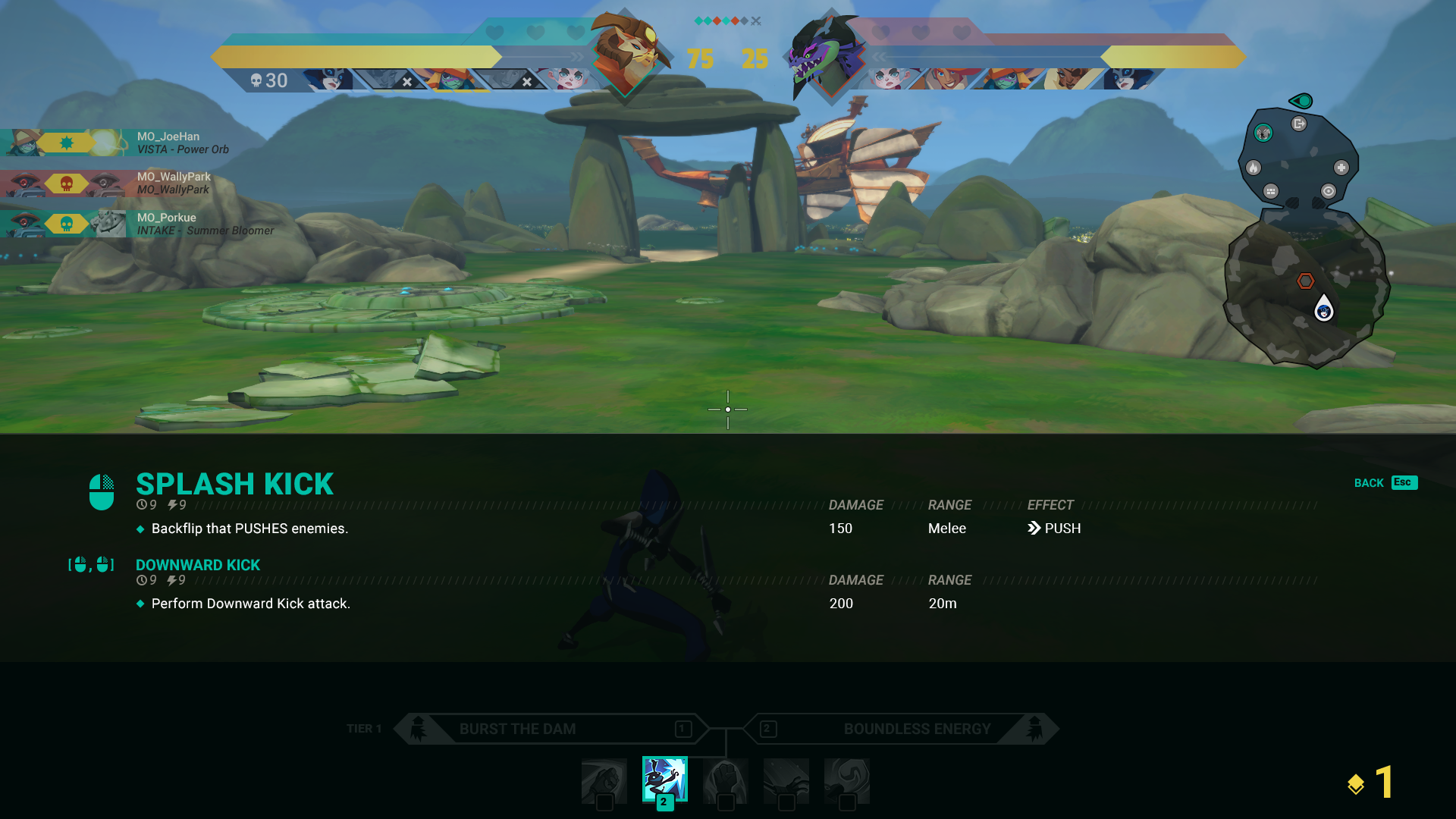
**Skill Tree A:** This tree was designed to maintain the previous horizontal layout and incorporate additional stats. Unlike the previous design, controller inputs were now included when a sub-skill was present, or the base skill was altered. (1/2)
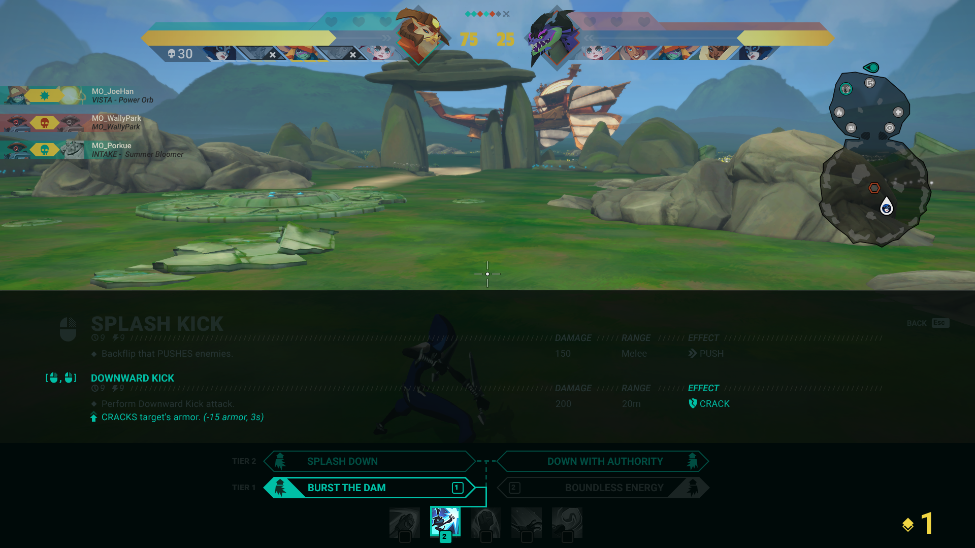
**Skill Tree A:** Only the relevant upgrades were highlighted for quick comparison. (2/2)

**Skill Tree B:** In terms of hero skills, the majority of player interaction would be similar to other in-game actions, such as summoning and the recommended upgrade system. (1/2)
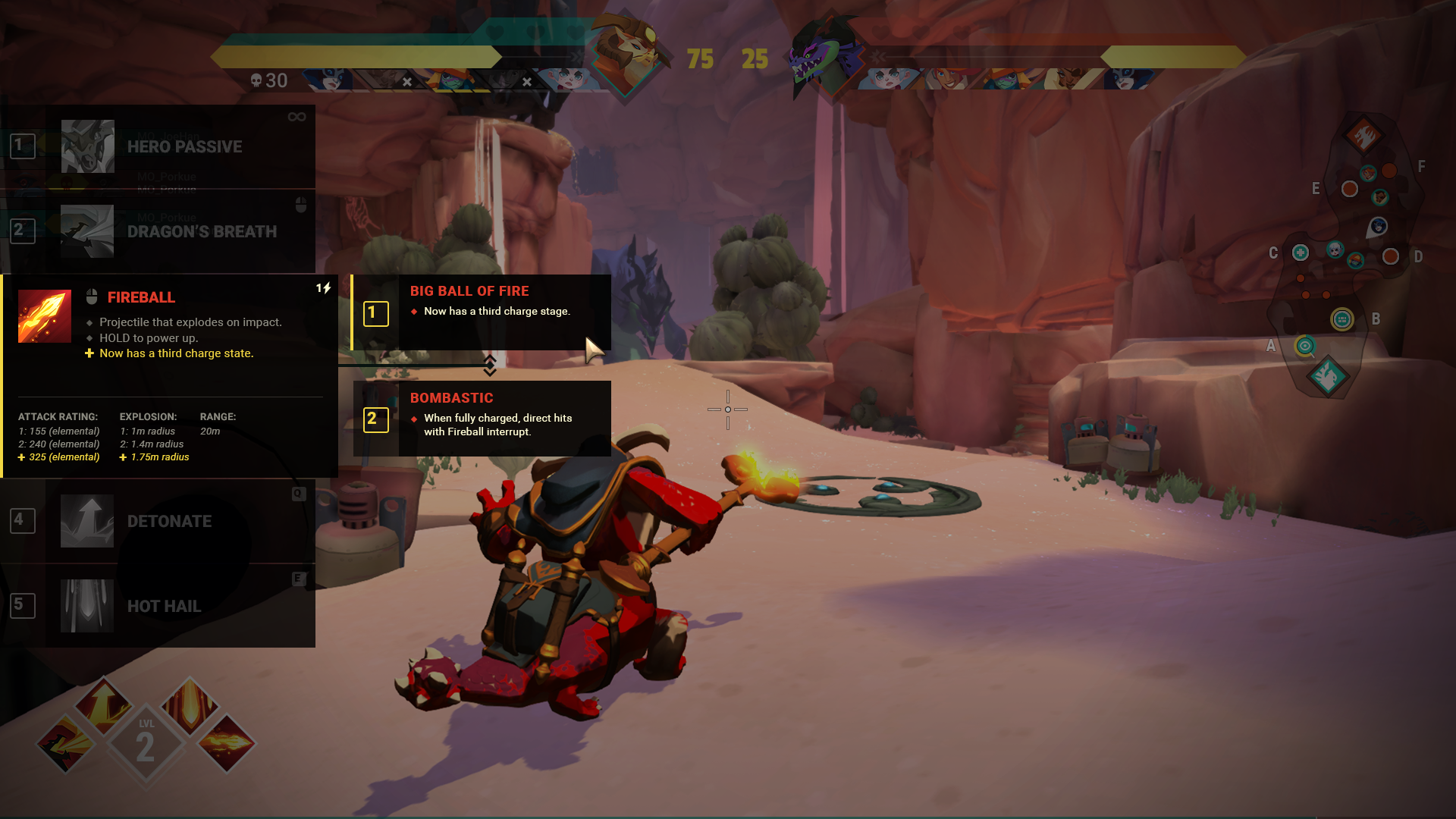
**Skill Tree B:** Similar to Skill Tree A, only the upgrade changes are highlighted. The controller input keys were to be used for keyboard shortcuts for the upgrades. (2/2)
**Skill Tree C:** After further evaluating the flexibility required from upgrade to upgrade, we ultimately decided to proceed with Skill Tree C. (1/3)

**Skill Tree C:** The upgrades and paths were distilled into a series of icons representing their core changes. (1/2)
**Skill Tree C:** To help players build their hero during a match, they were able to preview each upgrade path and its potential outcomes. (1/3)
////////////////## Launch Solution
Due to the lack of developer resources to accomplish the design of Skill Tree C, an evaluation was carried out to improve the current upgraded tree.
Skill descriptions were enhanced by adding status icons and adjusting the sizing. All skill tree sets were relocated to one location for better user focus.
////////////////## Health & Stamina
To improve the player's gaming experience, we relocated the health and stamina bars from the center of the screen to the skill bar. This reduced visual clutter and consolidated all player information in one place.

### Level, XP and Upgrades

Additionally, we implemented a "flash" system to notify players better when they are taking damage. The height of the flash varies according to the amount of damage inflicted.
////////////////## Icon Consistency
Before joining the team, multiple status icons with differing colors and levels of importance were visible in the world. To enhance consistency, the icons were classified and color-coded.
Moreover, fresh sets of icons were designed for the skill descriptions. To maintain uniformity, the rules from the status effect icons were implemented in the passive upgrade icons.
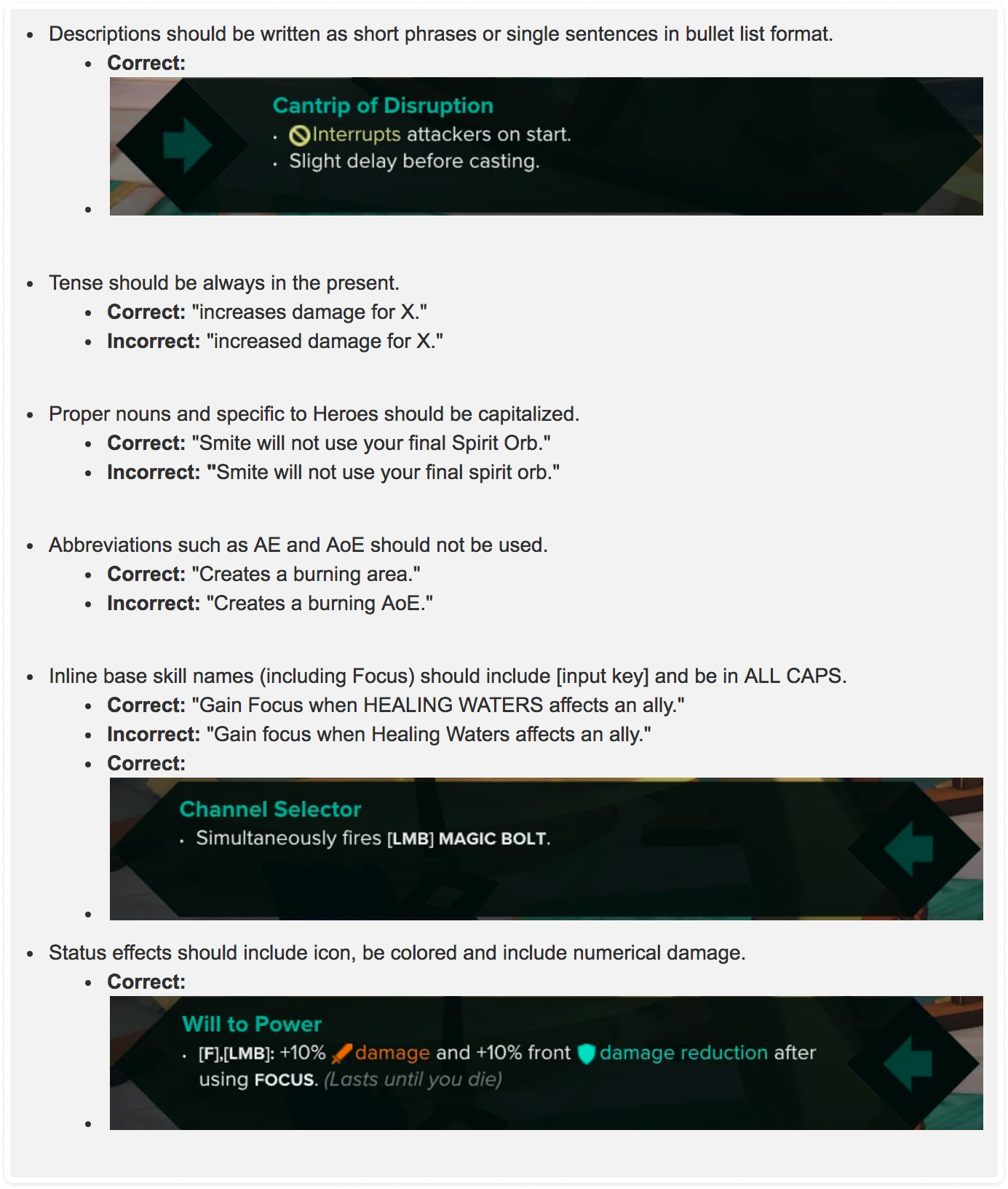
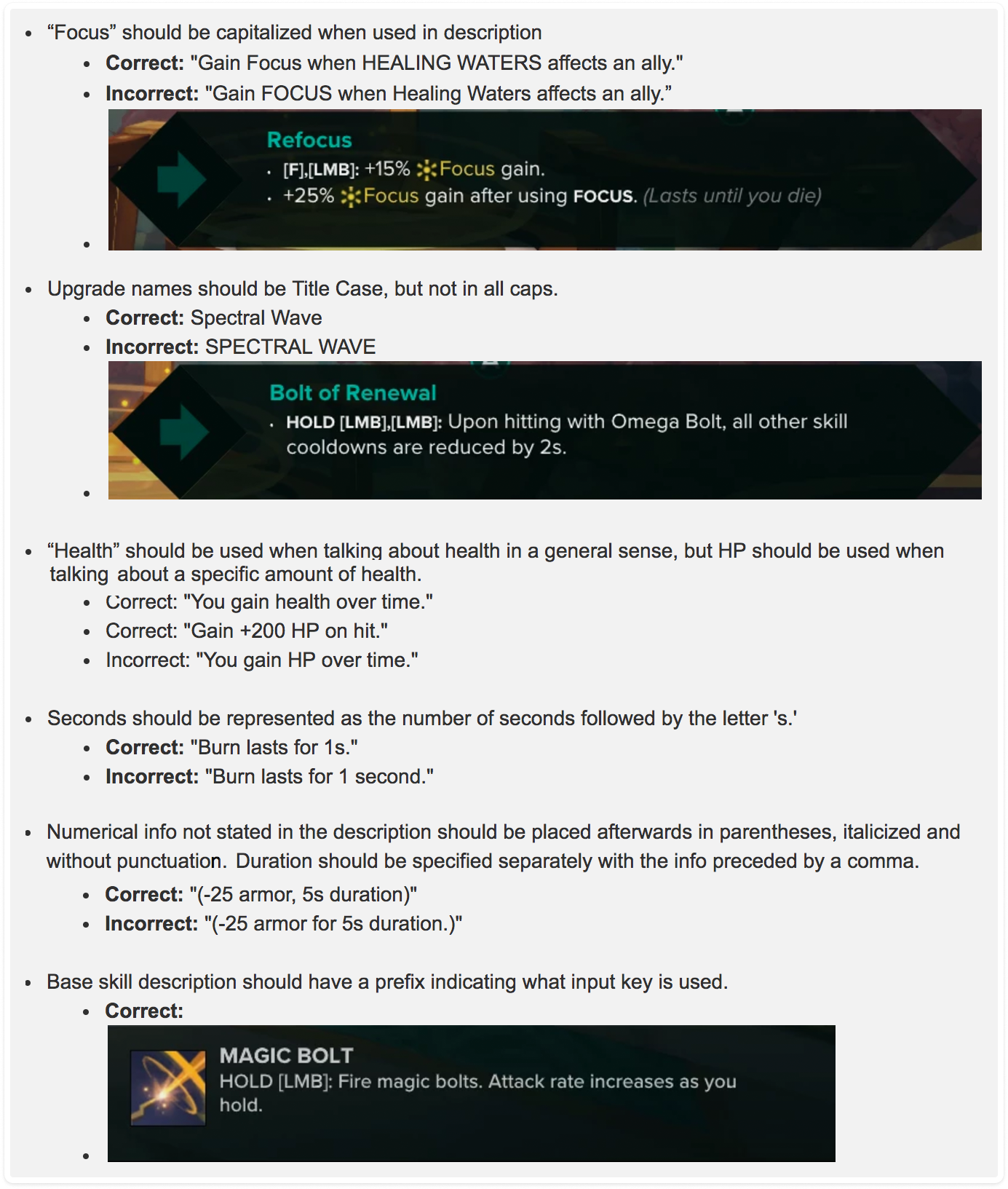
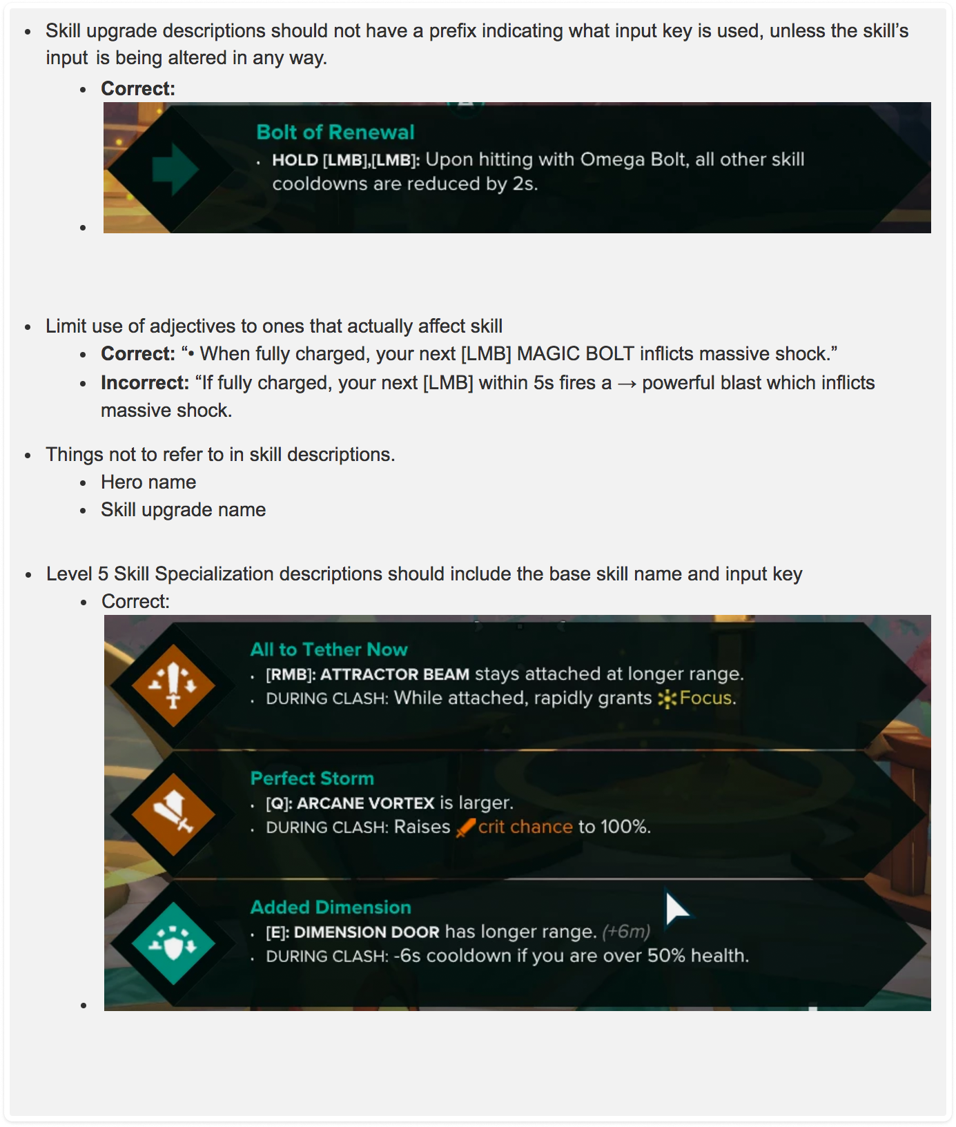
////////////////## Description Rules
The descriptions were often long and didn't match each other. To make things easier to understand, we analyzed the upgrade trees, identified the significant changes affecting the basic skills, and presented them clearly and concisely.
Additionally, we had to follow specific guidelines when writing the content and descriptions and organizing and presenting the information.
Credits
Timeline
2015 – 2017
Launched
July 2017
UX Lead
Sam Kirk
UI Artist/Designer
Nick Wiley
Studio
Motiga
Creative Director
James Phinney
UX / UI Designer
Levin Sadsad
Producer/Writer
Yule Hill